Poor Richard*s Books
REDEFINING THE BOOKSTORE EXPERIENCE
IN THE AGE OF A PANDEMIC
ROLES
UI DESIGNER
UX RESEARCHER
UI DESIGNER
UX RESEARCHER
TOOLS
SKETCH
PHOTOSHOP
SKETCH
PHOTOSHOP
DURATION
2 WEEK SPRINT
2 WEEK SPRINT
Background
Poor Richards is a long standing staple of Colorado Springs offering their patrons a variety of goods including toys, gifts, food, and books.
In the wake of the pandemic, Poor Richards needed a solution to address their loss of revenue.︎
This manifested itself in the form of a soft rebrand and website redesign on a tight deadline.
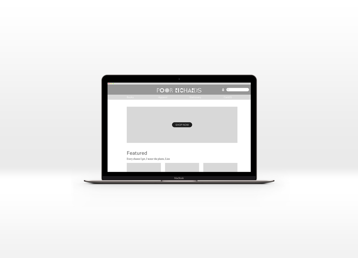
 Poor Richard’s Original Home Page
The Challenge
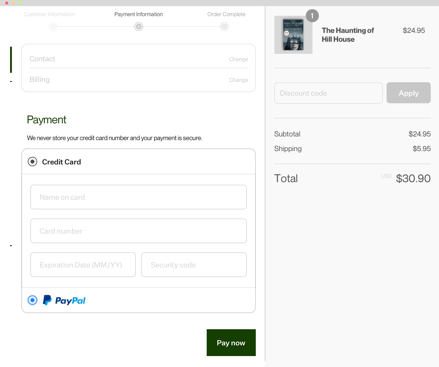
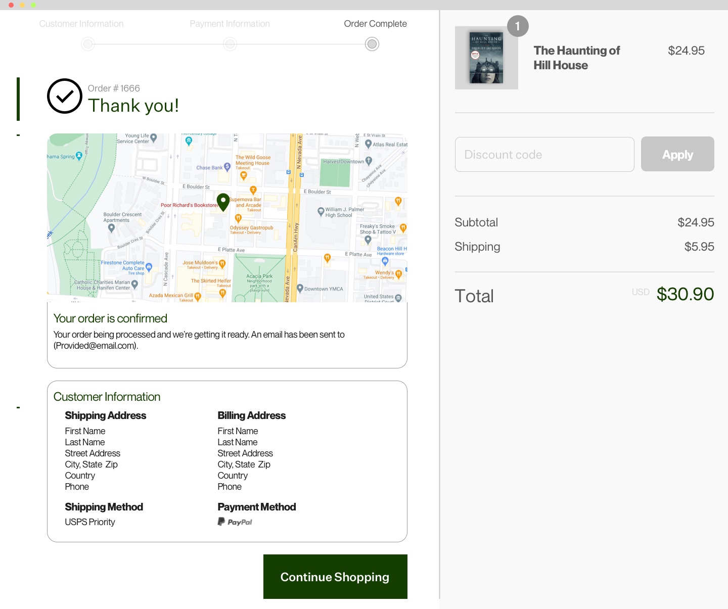
The challange of this project was to offer a digital user experience parallel to that of spending time in your favorite book store while offering a quick and efficient browsing and checkout process.

Updated home screen
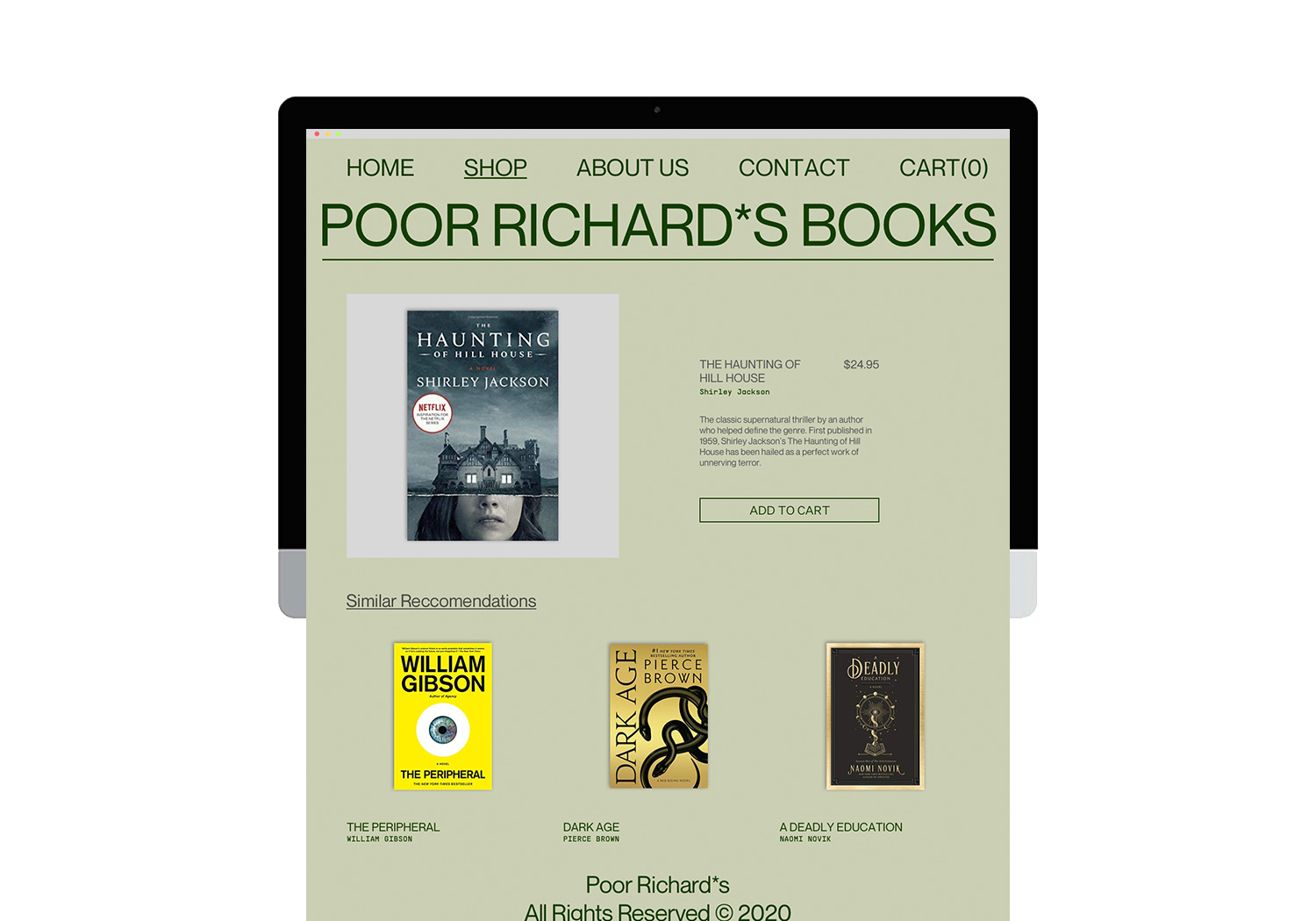
Updated item detail screen
With a 2 week turn around on this project, I quicky got to work and began evaluating their current site thru various rounds of user testing to identify pain points and begin engineering solutions.
Scope
Heuristics
Card Sorting
Soft Rebrand
User Interviews
Web Redesign
Heuristics
Card Sorting
Soft Rebrand
User Interviews
Web Redesign
Problem Statement
“Our users need a quick and efficient way to access our products online and complete purchases with ease.”


The original site design was too busy and all over the place visually.
User Testing
The first round of user testing was to perform Heuristic evaluations. Having users walk us through how they currently use the website to purchase a gift helped identify bottlenecks in the current user flow!
What was found:
- Users had a hard time navigating* the website.
- Slow page load times made users want to leave the website and go elsewhere.
- The checkout process was not intutive.
*(way too many nested dropdowns)
What was proposed:
- Restructure the global navigation of the site.
- Refocus the Inventory to focus on books first.
- Don’t reinvent the wheel, utilize Shopify API.
What was done:
- Card Sorting to determine effective navigation buckets.
- Simplify the busy-ness of the overall website.
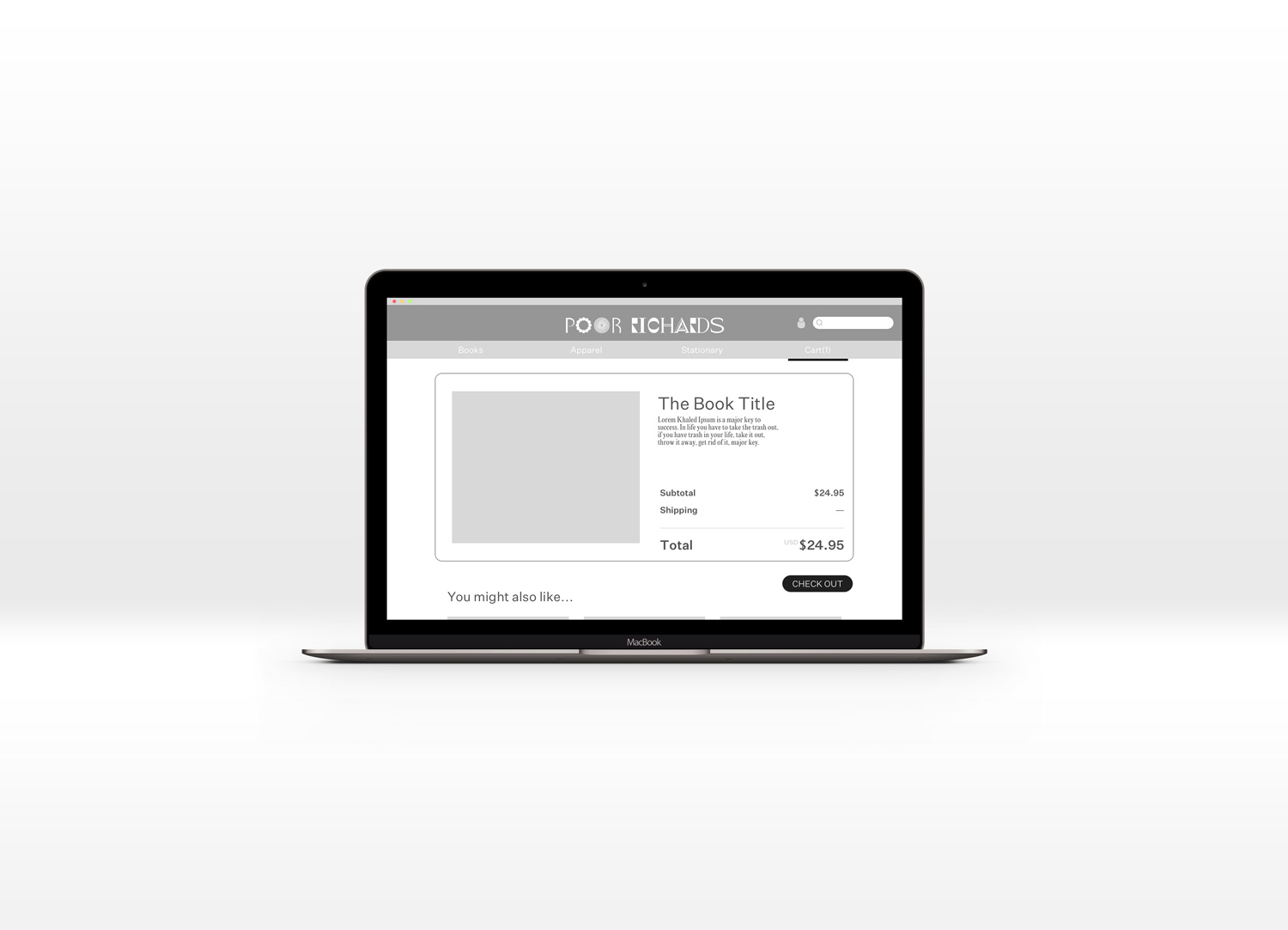
- Expedited the check out process with Shopify.
The next few steps involved synthesizing user feedback, paper prototyping, and 3 more user tests to reach the greyscale prototype below.
︎︎︎︎︎︎︎︎︎
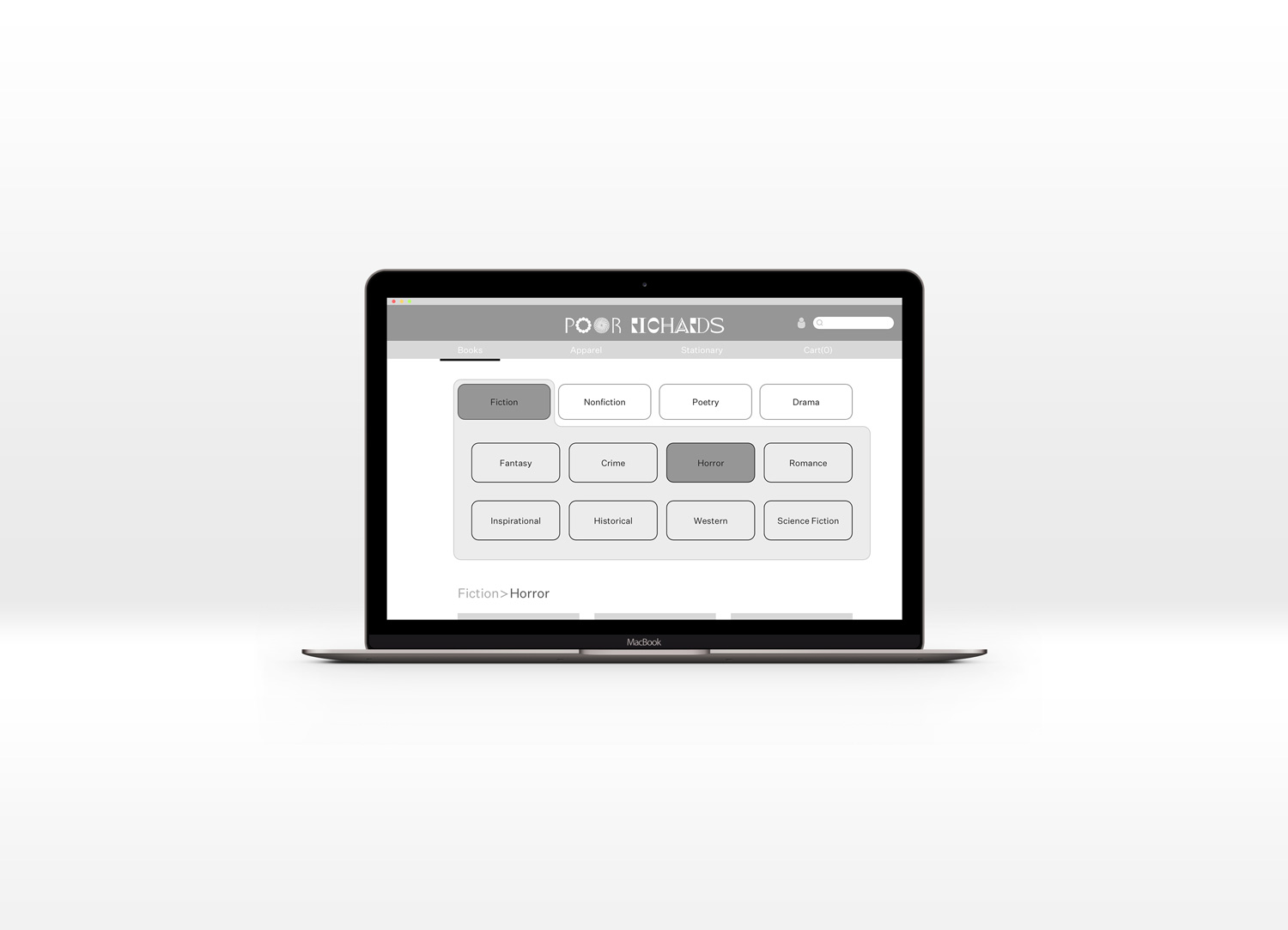
Through the second round of prototyping and user testing, I ran into an issue.︎︎︎
The navigation of the genre filter was communicated to be confusing and not as easily interpreted as I anticipated.
So I kept that front of mind moving into the final phases of the redesign.
This is where we landed at the end of it all.
︎︎︎
On a MICRO level
We wanted to cut down the time it took for our users to complete a purchase on the site, thus increasing our conversion rates.
On a MACRO level
We wanted to recapture the feeling of browsing your local bookstore in a safe and secure, virtual environment.
Hi-Fidelity Prototype
Soft Branding


Screens
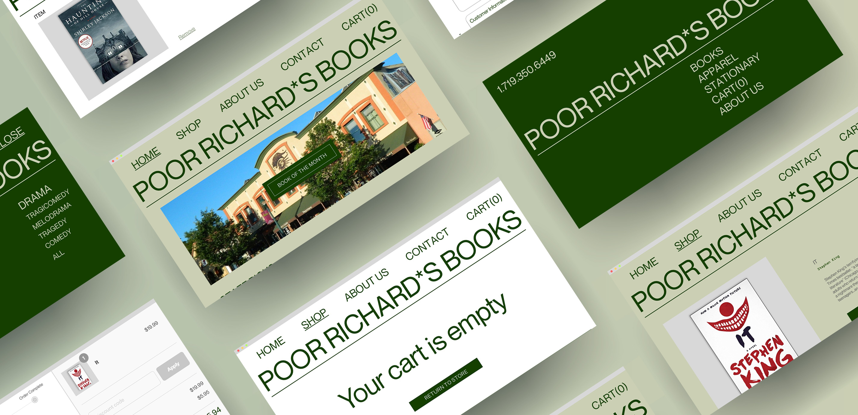
Talking into consideration the difficulties present in the previous navigations system, I opted for a full screen global navigation that was clean, clear, and concise.


At the end of it all we ended up delivering a clean, contemporary site that puts the visuals of the books at the forefront of the site and makes the browsing experience more enjoyable.
Reflections
The next steps moving forward with this redesign would be to perform usability testing on the final version and begin the process of iteration over once more. Later down the line we could begin reintroducing more of the original inventory back into the store.
User Testimonials
“I really enjoy the new design, the full page navigation keeps it simple and easy to use” - KG
“I feel like the design of the website made it easy to find what I was looking for a check out quickly” - KB
“It makes me want to explore more of the website and see what else they have to offer” - NB